What if we launched a Storybook website and encouraged developers and designers to create radical new UX/UI designs and related components to surface federated services and solutions.
We might offer a set of tools and guidelines for the development, maybe a standards-based techstack.
I just commented to Semantic Fedi chatroom, and also wrote 3 toots on the matter…
I bumped into the article via this HN discussion, making a fairly elaborate exploration of the concept. When it comes to envisioning a wholly LD-based Fediverse I imagine that this technical aspect would allow creation of innovative social experiences that go well beyond UX we are used to. A newcomer exclaiming in delight “Wow, what the heck is this?” and some reply-guy answering “This, my friend, is the power of Linked Data that we talked about for all these years”.
That step, projecting the vision, is what I find is mostly always missing in LD ecosystem. “If only we do all these complex things, magic will happen”. There’s not much to inspire devs to take the leap. In an LD-based Fediverse not only content would be aggregated into interesting views, based on the semantics and context, but also the dynamic functionalities that act on said context. The current trend in LD is that folks in AI world see the merits, to improve their systems. Which, given how AI is thrown into society and damn the externalities, isn’t something I feel positive about.
Would there be merit in depicting innovative UX/UI social networking concepts, that require Linked Data to model them?
In malleable systems chat based on an article of “User Driven UI” an UX experience was discussed whereby a search box would lead to discovery of other UI features that are available in an app…
I responded with:
Mentioned in the article is how progressive disclosure may lead to overlooking features that exist in the app. I’ve read a number of UX discussions in the past arguing to avoid this pattern and make all possible navigation paths as clear as possible. A hard issue to solve, as you don’t want that ultra-complex cockpit either.
Based on stuff that Bret Victor did wrt next-gen UI and the MercuryOS conceptual design, I have been musing / dreaming about UI based on an infinite canvas whereby the UI widgets ‘unfold’ like a mind map from core concepts and gain more detail when focused and zoomed in on. The navigation on such canvas would work similar to how Prezi’s “visual storytelling” works, except that it is not just used for presentation but for live and dynamic UI interaction. Furthermore the apps / services / widgets would use social networking and facilitate collaborative editing / interaction.
In this UI paradigm you could open all kinds of navigation paths that pan out onto the infinite canvas, and still jump back and forth to different contexts. Like MercuryOS the paradigm is not based on a desktop metaphor, or a hierarchical file system.
I should add that in this new UI paradigm there can be more differences to how we are usually perceive UI. Take for instance a code forge. Here we have a button “Create PR” or something. When we click it and go through the PR process, at the end of that procedure, a list entry has been added to a PR collection called e.g. “Add feature XYZ”.
In this the UI is totally not process-oriented. It presents some abstraction of the overall state of the software project, from which via deduction we can reconstruct the ongoing work that is taking place. In my Prezi-like UI I might have a process-oriented perspective, presenting how I relate to the project and ongoing tasks. Esp. when zooming out. Zooming in ongoing work then leads to seeing more of the details that are part of current code forges.
This UI paradigm explores a space of spacial computing with infinite canvases, i.e. not VR/AR virtual environments but 2-dimensional spaces…
In malleable systems chat there was also mention of Pad++, an old project that posed the idea of Zoomable User Interfaces, for gradual disclosure of large amounts of data.
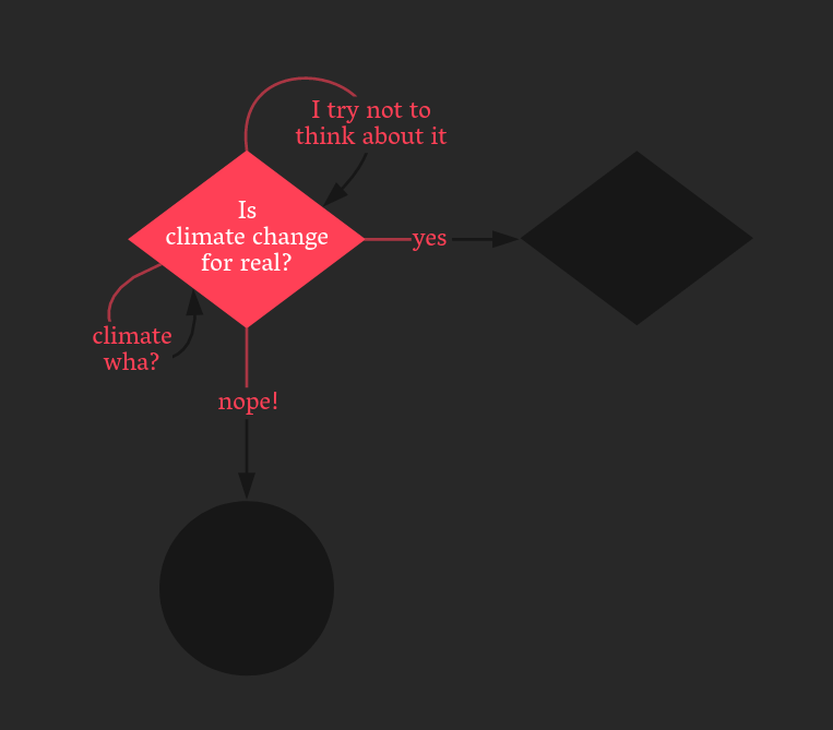
By making decisions in the flowchart progressively more information is disclosed about the “wicked problem” of climate change, and the UI invites to think about the ins and outs. The flowchart project code is at github and also has a course: