
Alt-text
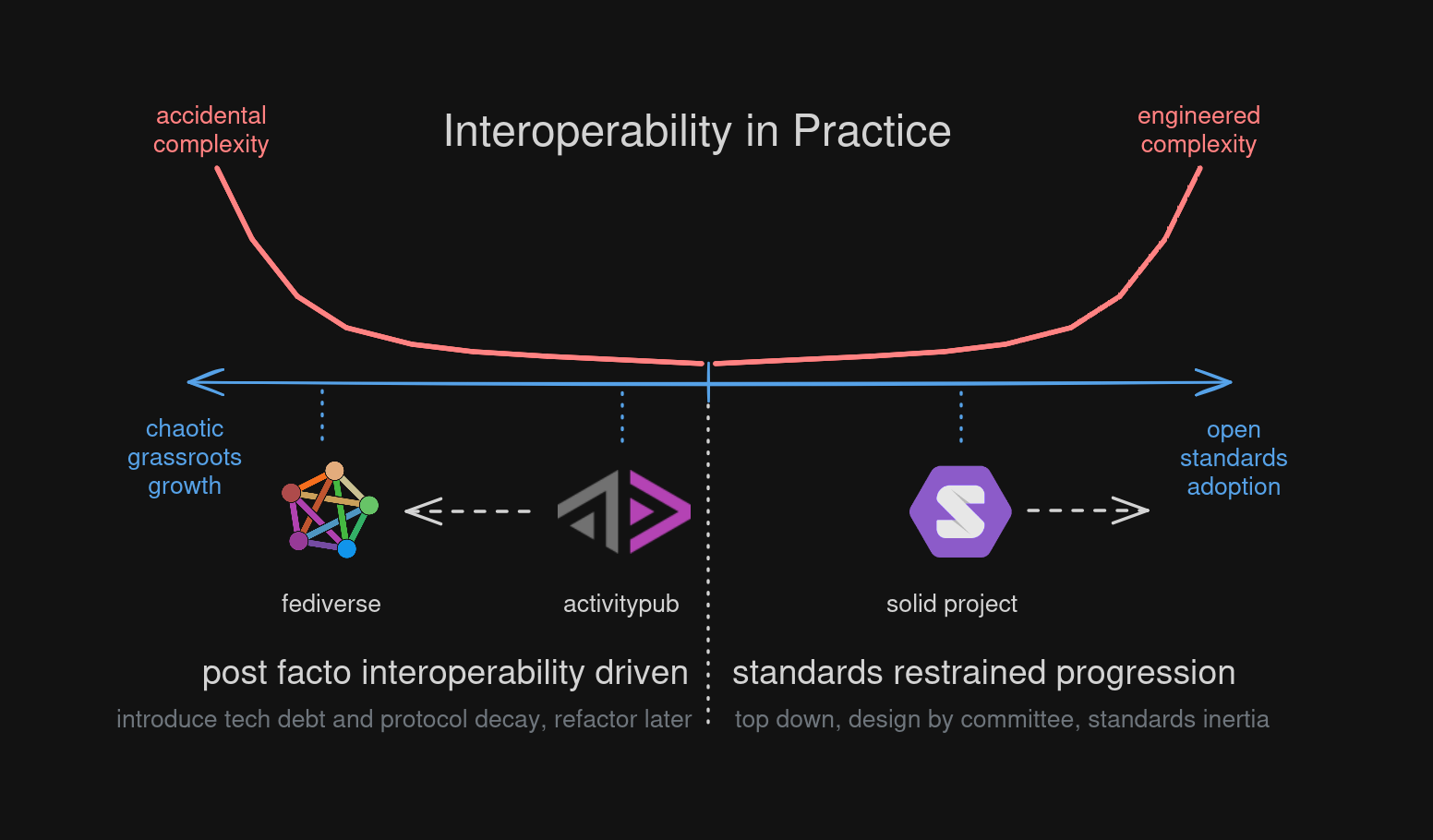
Diagram. Interoperability in practice. A chart with a horizontal axis that goes in 2 directions. On the left it moves towards chaotic grassroots growth, and on the right side towards open standards adoption. The Y-axis indicates level of complexity. The center indicates a low level of complexity.
On the left side of the axis we first find the ActivityPub open standard, with a relatively low complexity level. However the prevailing method to evolving the ecosystem is driven by post facto interoperability, where tech debt and protocol decay is introduced and accepted, which must be refactored and evolve alongside the open standard. Since this doesn’t happen, the fediverse grassroots environment is shifting more to the left into non-lineary increasing accidental complexity. Deviating more and more from the ActivityPub standard and the promise that it holds to offer the Future of Social networking.
On the right side, to contrast against fediverse, we find the Solid Project led by Sir Tim Berners-Lee, which is based on a whole range of W3C Linked Data related open standards and draft documents. There is no grassroots movement that drives progress, but a steering committee. Progress is restrained by open standards adoption and support. Higher levels of interoperability require more rigour and formal standardization, and this also leads to non-linear growth of, in this case, engineered complexity. Solution developers have to wait for many standards to mature, leading to inertia.